Hypermedia Design Principles and Techniques - by Mathias Mailu
- Know when to use a flowchart, a storyboard, and a script
- Recognize the five basic multimedia design paradigms
- Understand how the linear list design let the user move back and forth in a sequence of multimedia objects
- Understand how the menu design provides users with a choice of items, and how the hierarchical design provides levels of choices by linking menus to menus
- Realize how the multiple linking in a network design provides the richest form of interactivity
- Visualize how hybrid designs can incorporate lists, menus, hierarchies, and networks
- Define the content of an advanced application and adopt an appropriate navigational metaphor
Introduction
This topic talks about hypermedia design techniques that will help you plan the development of a multimedia application. You will learn to visualize the flow of your application and imagine yourself running through it as a user.
Design Paradigms
There are five ways to design the flow of a multimedia application: - the linear list, the menu, the hierarchy, the network, and the hybrid.
Linear list
The simplest design is the linear list you see in Figure 1. as the user clicks the mouse, the application presents the information, one item after the other. Each object in the list can be a text, a graphic, an audio clip, a video, or a compound object consisting of more than one medium playing at once3, such as a text overlaid on a graphic accompanied by a sound track. The user can move back and forth through the list, moving forward to new materials or backward to review.

Menu
The second way to design an interaction is to create a menu like the one shown in Figure 2. The items in the menu can appear as lines of hypertext, graphics in hyperpictures, or a combination of textual and graphical triggers. When the user chooses an item on the menu, the item linked to it appears and stays on the screen until the user makes another choice.
Hierarchy
The third kind of design is the hierarchy shown in Figure 3. Each object provides the user with a menu of choices that trigger more menus with more choices. There is no limit to the size or number of menus and submenus you can have in such a hierarchy.
Network
The most complex design is the network shown in Figure4, in which objects can be multiply linked in any direction to any object in your application. The network design provides you with a rich set of navigation options.
Hybrid
Multimedia applications often use more than one design paradigm, employing lists, menus, hierarchies, and networks where appropriate. For example, a sophisticated network design may trigger a list of images in a slide bank with simple navigation that lets the user move back and forth through the slides. When the user gets to the end of the list, the network design returns to provide richer navigation options. Designs that combine paradigms are called hybrid. Figure5 shows an example of a hybrid design.

Storyboarding
A storyboard is a series of sketches that describe the content of a sequence of multimedia screens. Figure 6 shows a sample storyboarding form, which contains a frame for sketching the screen layout, and a space below the frame for making comments. To create a storyboard, you fill out such a form for each screen in an application. Inside the frame, you sketch the design elements that will appear on the screen. In the space below the frame, you write comments describing the screen’s function and purpose.
Use the storyboard to reflect on the flow of your application. Spread out the sketches on the floor, tape them to a wall, or tack them onto a bulletin board. Arrange the sketches in their logical sequence – the order in which the user will view them. Seeing your screens all at once can help you make design changes before proceeding to the more costly and time-consuming development stage.
Scripting
After you storyboard a project, you are ready to script it. A script is a complete specification of the text and narration in a multimedia application. Especially when you are using a team of people to develop an application, it is important to have a written script. Scriptwriting makes the team think through the project thoroughly. A written script helps team members communicate with each other, share comment on the design, and make adjustments prior to beginning the costly development stage. Having a script helps you role-play the application from the viewpoint of a user and identify missing elements.
Flowcharting
Multimedia applications often require users to make decisions. A flowchart is a logic diagram that illustrates the steps involved in an interactive decision-making process. Flowcharts are helpful when designing conditional branching and answer judging in a multimedia application. For example, you might present a test question and ask the user to select the correct answer. Depending on how the user responds, you will either give some positive reinforcement and proceed to the next question, or you will provide remedial feedback explaining why the answer was incorrect. Drawing a flowchart can help you visualize the answer-judging process.
Figure 7 shows the shapes designers use to create flowcharts. The most important shapes are the rectangular “process” box and the diamond-shaped “decision” symbol.
The flowchart shown in figure 8 uses these symbols to diagram the answer4 judging in a multiple-choice question. In the process box at the top of the diagram, the user is asked a question. If the user answers correctly, positive feedback will reinforce the correct answer. If the response is incorrect, the computer will provide a hint and repeat the question. If the user fails again, remedial instruction will be provided.

Reference
Fred T. Hofstetter, ©1997: Multimedia Literacy, 2nd Edition, pages 374 – 380.
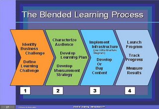
 This means that when we attempt to build an effective blended learning strategy, we will go through the following processes:

